Re-approaching Color
Sharing a new way to building color systems for accessible UIs that scale. Build your own with ColorBox.io.

Color is instrumental in how we perceive the world, and that could not be more true within interfaces. Color guides us to predict, understand, and make decisions.
Ever since you were little, you’ve been trained to pause at words in red and relax at numbers in green. You want to read text in black before text in gray. You click on things in blue. It’s so deeply embedded into how we experience products that we never give it another thought.
Color, at least on the surface, appears almost naively simple, yet as it scales across larger products it becomes unbelievably complex. You have thousands of people building products all at once, and those products are all heavily reliant on color. This puts a lot of pressure on the color system to ensure that all the products are being created consistently, but very hard to implement since it’s all too easy to apply colors on a one-off basis.
Earlier in the year, my team was getting swamped with questions about how to use color, how to add colors, how to modify colors, and how to work with accessibility. And the number of open questions was only getting worse as our design and engineering teams both grew. My team is responsible for building and maintaining our design system, the Lyft Product Language.
Our existing color system wasn’t working, and we realized for us to be succesful with color we would need to do something extraordinarily different. To do that, we had to start from the beginning and scrap everything we knew about color systems.
Naming colors
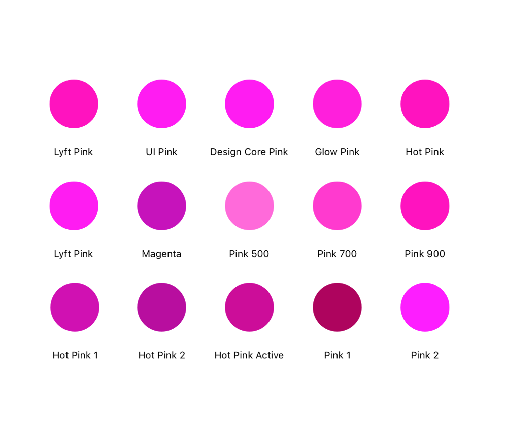
While auditing the colors we use at Lyft, we found the remains of many previous color system attempts. It felt a bit like an archeological dig as color names like moon, slate, and bone all pointed to similar shades of gray, and other color names like mulberry, purple, and violet pointed to similar shades of purple. This was a big problem for us with especially when it came to our iconic Lyft pink. We found 15 variations of pink across our products.

When we began, we wanted to truly understand why fragmentation was happening. Once we paid attention to how people, especially in different disciplines, described colors to one another we noticed an organic form of deviations occurring in the way they spoke about colors.
It feels obvious now, but it wasn’t at the time. In order for us to truly be successful, we needed to have designers and engineers speaking a common vocabulary around color. What that meant was designers and engineers could both point to a color and say the same color name, but also the opposite if given a color name both designers and engineers could reasonably guess what it would be. In essence, we needed a language to support color.
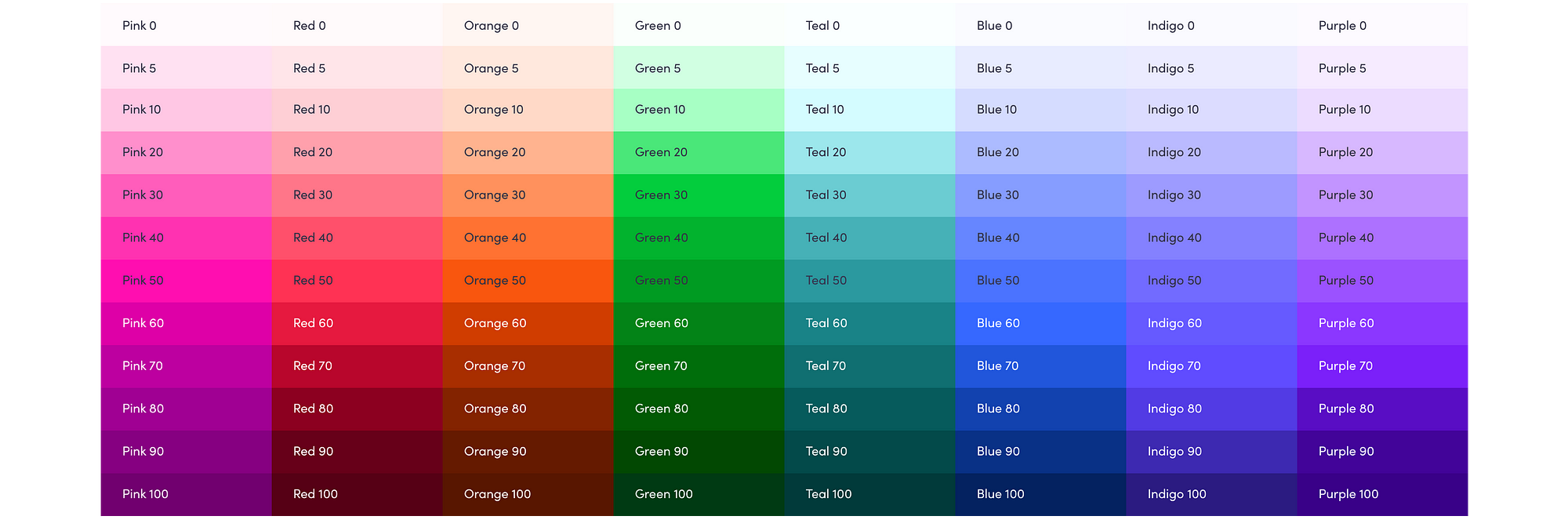
We noticed when people talk about color there are two fundamental pieces being communicated. There was the hue of the color, which pointed to a space on the color wheel, and there was the modifier that pointed to the degree of lightness or darkness of that color. So you’d commonly hear light blue, dark green, deep red, etc.
We knew that building a language for color would be trivial compared to getting people to actually use it day-to-day. So we needed to nail the cost-to-value ratio, meaning the system must be simple to learn and highly efficient.
To make sure it was simple, we leveraged people’s existing color knowledge, so we adopted terms like blue, green, and red to describe hue. For more complicated colors, we preferred shorter, easily spelled words that were fairly easy to learn like mint, teal, rose, etc. We also needed to factor in that the language could last for quite some time, so we chose to plan for every color conceivably possible, and then map them to a hue range. Since there are only 360 hues, we wouldn’t need to change this even if Lyft were to change brand colors. If we ever need to add support for a new hue in the future, we would combine hue names so that we don’t need to modify the existing language infrastructure (e.g. red-sunset or pink-purple).
Bron: https://design.lyft.com/
