Whitehouse Chooses WordPress
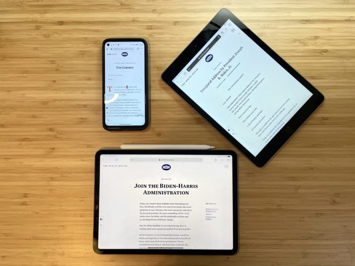
With the change of administrations comes a new website, and this morning the all-new Whitehouse.gov debuted. Like its predecessor, the site is powered by WordPress – but this version carries many differences and modern out-of-the-box features that we’re glad to see used on a site of this magnitude.
Dave Amirault, Pagely’s Director of Marketing, and Jeff Matson, Minister of Propaganda, have had a few moments to gather their first impressions of the site.
Dave – THE DESIGN
Personally, I’m a sucker for clean and focused designs, and the new Whitehouse.gov delivers on both those fronts. Images are clean, not overused and work to supplement the content on the page – not overtake it. The site’s navigation is simple and does its best to guide users through the site’s taxonomies.

ACCESSIBILITY FEATURES
A website meant for the people should be able to be seen by all people, and Whitehouse.gov does a great job making the site’s accessibility capabilities front and center to users. As we all know, website accessibility is a source of constant improvement, and they even go so far as to address it in the site’s Accessibility Statement.
Notable Features
- High contrast mode.
- Large font size toggle.
- Spanish Translation


EASTER EGGS
What’s a website in 2021 without an easter egg or two? Inspect the site’s source code and you’ll be treated with this recruitment message by the United States Digital Service.
Well played.

Matt Mullenweg found another easter egg that posted about it on his blog – go down the rabbit hole into the theme’s CSS file and you’ll find the perfect version number.
Bron: https://pagely.com/blog/